Designing a logo is a very personal process — personal to you, the client. It can’t be a personal process for the designer. It should be the outward representation of the purpose of your company, product or event.
Click on the 1st image below, then use the left/right arrow keys on your keyboard to move thru the images.
Descriptions of each piece are located at the bottom of the page.
- Logo for Online Store
- Logo for creative marketing group.
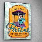
- Logo for 150 year old event in Las Vegas
- Logo & Identity package for writer.
- Banner for Online Store
- Logo for online store
- Logo & Identity package for music composer/producer.
- Logo for construction company in Australia
- Logo icon for 40th Anniversary celebration
- Logo for financial information website
- Logo for Artists’ Materials Expo 2012
- Logo & Banner for Online Store
- Logo for PBS pilot for car restoration show.
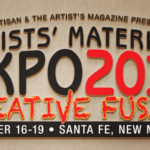
- Logo for Artist’s Materials Expo 2014
- Logo & Identity package for consulting firm.
- Logo & Identity package for production company.
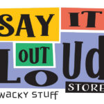
Say It Out Loud Store
This is an online tshirt company, that produces wild & wacky stuff. Created their logo, and even pitched in to do a few tshirt designs.
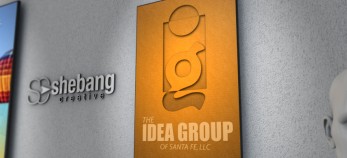
The Idea Group of Santa Fe
When approached by Jim Patterson & Jim Glover of The Idea Group of Santa Fe to give their company — a company that brands other companies — a brand of their own, I knew I had to create something that was ‘outside the box’. So that’s where I started.
Fourth of July Fiestas
Jim Glover from the Idea Group came to me with this job. The Las Vegas Fiesta is a 125 year old event, held in Las Vegas, New Mexico every 4th of July. It’s an event that combines a lot of Hispanic history with American history. After trying many different looks, I came to this one, which required creating the gazebo — which is a replica of the gazebo in the plaza of Las Vegas — in a 3D program, and then “cartooned” the look with the dancers. The logo was used in all their materials, brochures, signs, tshirts, advertising, etc.
The Craden Group
Jerelyn Craden is an Event Developer/Coordinator/Writer, and Marketing & Advertising Writer in Canada. I always love creating logo’s for other creatives, because they always want something that’s different, not a “standard” logo look. I had a lot of fun designing this for her.
Line of Light Portal
Designed logo and website banner for this company that sells positive, meditative and spiritual type of items online.
Artisan Online
Artisan Art Supply in Santa Fe has been a client for almost ten years. They needed a branding for their foray into the online version of their brick & mortar store.
Brian Piper Music
Brian Piper is a music composer & producer, and has been a great friend for over 25 years. I was happy when he asked me to come up with something that would brand him as the great talent that he is.
Chocolate Shape
This was a fun project for a great client and friend, Tom Wright. Tom not only asked me to create the logo, but also the packaging for this product. And it tasted great, too!!
The Meunow Group
A lot of logos contain the first letters of the company’s name, so that you can easily remember the company by just seeing the logo. After doing a number of those types of logos, you have to get creative with how you combine & represent those letters.
Artisan 40th Anniversary
Artisan needed an icon for their 40th Anniversary celebration, which they used throughout the year to help brand them as the premier art supply store in the southwest.
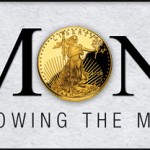
OurMoney.net
This logo needed to convey strength and trust, for a website dealing with all things money.
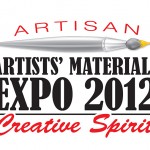
Artists’ Materials Expo 2012
This logo was just a part of the design work I created for Artisan Art Supply, the sponsors of the biennial event, which was the largest of its kind in the world for 2012.
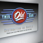
This Old Car
This is a logo for a PBS pilot called “This Old Car” that unfortunately, never made it to air. It was supposed to be a takeoff of the ‘other’ popular show of the similar name. Of course, I had to have a shiny grill for this one. I think that means something else now. Oh well…This was created in a 3D animation program, to get that “off the page” look.
Artist’s Materials Expo 2014
The 6th biennial event for Artisan’s flagship expo (and the 2nd one I worked on). They needed a freshen-up of their logo, to go with their ever-revolving tagline, “Creative Fusion”.
Trisha Brinkman Consulting
I created Trisha’s logo as part of a larger package, including her website. She owns a workplace resolution consulting firm in Santa Fe.
The Right Idea
A production company in Dallas, they wanted a classic, yet strong image for their new identity package, that emphasized the concept that no matter what they are called on to produce, they can handle it.


